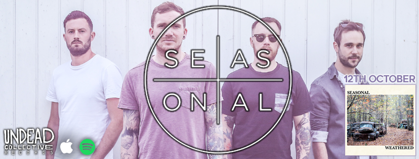
UK pop-rock band Seasonal released sophomore EP Weathered via Undead Collective Records on October 12th. The 5 song EP is the band’s best work to date, recalling the catchiness of early Deaf Havana and You Me At Six, but with a newfound maturity and evolution that’s distinctly Seasonal. EP finale “Twelve” really encapsulates the grandiose and anthemic pop-rock this young band is going for.
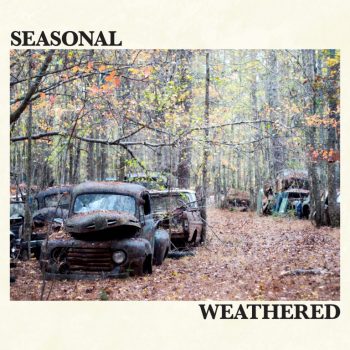
Frontman/bassist Matt Truseler summarizes the vibe: “Our music has definitely evolved over the course of the year – whilst musically we still sound like the same band, we found ourselves enjoying writing higher tempo tracks. The title and artwork, a photo a friend of ours shot at Old Car City in the States, signifies our progression away from being a new project and really maturing our sound, taking it to the next step, as a band.”
Get to know the story behind the band’s artwork for their new EP below, and if you like what you hear, give the album a few spins and tell a friend, because it’s uncanny just how solid the new Seasonal EP really is.
Can you tell us who the photographer for your artwork is & why you picked them?:
The artwork for ‘Weathered’ was created using a photo taken by our friend (and practise studio owner) Dan Munday. He went to the States and visited a place called Old Car City. We saw the album on his Facebook and loved the images he captured and he kindly said we could use any we wanted to!
What did you want to represent and what conversations that lead to the creation of the cover?:
We wanted to have similar imagery to that of our debut EP ‘Bloom’, but rather than having a bright and vibrant cover, we wanted the image to reflect the EP title ‘Weathered’. This lent itself perfectly to the abandoned cars that are stacked up and left to decay in what is a beautiful woodland, and we liked how it tied into both the content of the EP as well as the band name.
Did you have any other ideas in mind?:
There were a lot of ideas thrown about originally but we were certain on the EP title being something that gave imagery of something maturing or old. We had ideas to call it things like ‘Rust’ for example, but landed on ‘Weathered’ once we got our hands on Dan’s photos, and felt it fitted as we had originally envisioned.
How does the cover tie into the rest of the releases components?:
We haven’t finalised any physical copies yet, but we would love to include other images from Dan’s album to create an awesome visual for the inlay and lyric pages; if not just to showcase his talent and eye for some great shots!
Finally, is there anything else you’d like to share about the artwork?:
The cover we have used was essentially the original idea and what we were going with. The first draft the image was not set in the cover though and the title was just set on the image. We didn’t like how that took the perspective out of the shot, so decided to set the writing around and chose a burnt off white to sit it on. We think the final product looks great!
